What Is a User-Friendly Website? 10 Dos & Don’ts

One of the key elements to managing a successful practice is providing a great user-experience through your brand’s user-friendly website.
It is painful to interact with a website that has not been developed with user-friendliness in mind. It’s frustrating, confusing and quickly makes you abandon ship, or abandon shopping cart in more modern terms.
The experience of your website can drastically influence the opinion potential clients have of your practice or service. If it is less than great, it can even drive them towards a competitor, which is the last thing you want.
What then makes for an excellent user-experience and user-friendly website?
In this article, we’ll highlight our team’s ten most important dos and don’ts for creating a memorable brand interaction and user-experience on your website.
5 Crucial User-Friendly Website Design DOS
1. Choose An Easy-To-Use Website Design With Your Client In Mind
Designing a new website for your practice is exciting, and it’s easy to get carried away with all the bells and whistles. It’s imperative to have empathy for your user who will be unfamiliar with your platform.
Keep your clients in mind at all times when designing the platform. Consider their needs, their experience, and how a user-friendly website will lead them to their end goal or solve their problem. Create a page hierarchy and flow that is simple and easy to understand.
2. Use Simple Language and Clear Content
It’s important to use simple and concise language. Avoid using jargon, acronyms, or colloquial language that everyone might not understand.
In addition, keep your sentences short and to-the-point. Allow your users to find the information they came for immediately and don’t make them struggle to find it.
3. Make Your Website Visually Appealing But Keep It Clean
People eat with their eyes first and that saying doesn’t just apply to food. Your website should be pleasing to look at.
Design your website using your brand’s color scheme whilst keeping the psychology of color in mind.
According to WordPress theme designers at Silo Creativo, an overload of patterns and colors can quickly distract a user from their main purpose and will cause them to negate from reaching your website’s goal or call to action.
We suggest using simple structures, legible fonts, and to always focus on contrasts when considering font colors and background colors to ensure a user-friendly website.
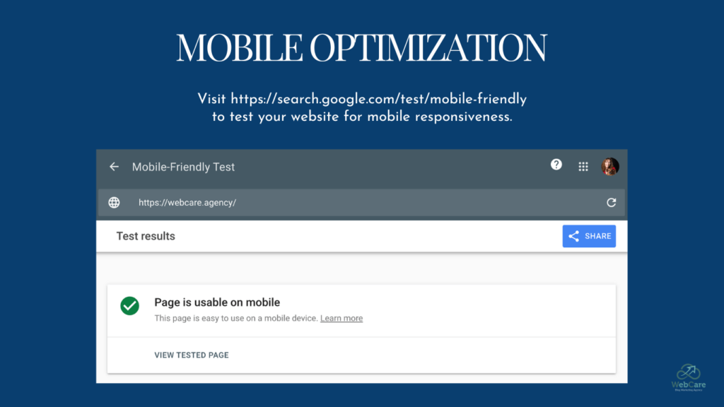
4. Mobile Optimization and Responsive Resizing
This point alone is worth an entire post on its own. Currently, the chances of a potential client viewing your website from their mobile screen or tablet are higher than ever.
Having your website optimized for mobile and tablet screen sizes is now even more important than having it fully functional for computer screens.
Not only will this increase your client base and lower bounce rates (when users navigate away from a site or page after viewing the page for only a few seconds), according to SEO experts at Search Engine Journal, having a website that has well-executed responsive design improves your SEO score. In their words, “Google Prioritizes Mobile-First”, meaning that Google prioritizes mobile-friendly websites above those that are not made to fit mobile screens, when it comes to ranking and score.
Ensure the images uploaded to your website are adjusted in size and their placement fits in mobile and tablet versions of your website. They should not distort, overlap, or cut off. A good rule of thumb is checking that the file size is less than 100KB.
Your original texts should be correctly aligned and not distort due to resizing, and all elements must be in harmony with one another on all platforms and screen sizes.
A good habit is to test, test, and test. Shrink your desktop screen to that of a tablet or mobile, or use your mobile screen to test page layouts and see if everything is ‘ship shape.’
For more information on this important point, also read our article – 5 SEO Don’ts Website Owners Should Avoid.

5. Quick Loading Times
A five second waiting time on the internet feels equivalent to around three years in real life (this is a scientific fact of course).
Large media files, excessive plugins, videos, and caching issues are all examples of elements that can cause your website to lag. Routine tidying and health check-ups on your website are crucial to avoid a slow and frustrating user-experience and also to avoid negatively impacting your site’s SEO score. Ensure all pages and elements on your site load quickly and that they keep their quality to ensure a user-friendly website.
It ties in very much with point #4 – Mobile Optimization. These two factors, on their own, have a major impact on user experience.
5 User-Friendly Website Design DON’TS
Now that we’ve covered our five most important DOS when creating a website for formidable user-experience and user-friendly website, it’s time to focus on the pitfalls and what to avoid:
1. Lacking A Clear Call To Action (CTA)
One of the most common errors we notice on small company websites is a missing call to action.
What is a call to action?
A call to action, commonly referred to as a CTA, usually comes as a button or link that entices your client to follow this specific prompt as their next action or step.
Common CTAs include ‘Add to Cart’, ‘Learn More’, ‘Sign Up’, ‘Buy Now’ and more.
These prompts aren’t creative or complicated.
Avoid CTAs that are vague and not relative to what the user expects to get once they click on the button. For example, ‘Go,’ or ‘Start’. Such prompts does not inspire a user to take action. Better verbiage could be ‘Start my free course.’
Correlate the text on the button with the reader’s expectation – for example, ‘Assess my website’, which leads to a free website assessment tool. Or ‘Download my free coaching manual now.’
Do not be misleading, as you could damage the trust you are trying to build. If you offer a free worksheet via email, do not prompt ‘download the free worksheet’ but state ’email me the free worksheet.’ The wording on the CTA button should match the ensuing result exactly.
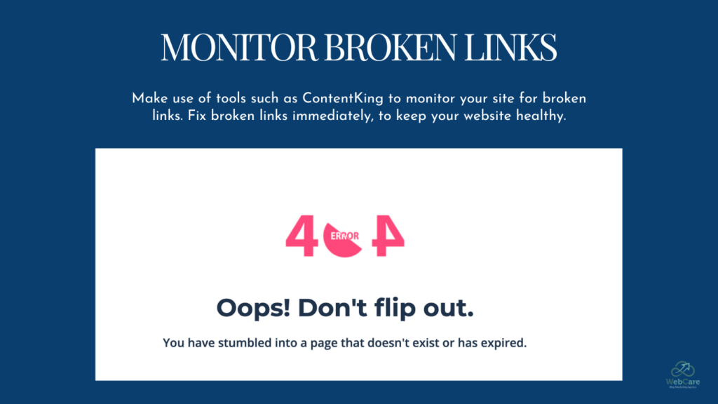
2. Broken Links And Old Content
While researching this article, I had a frustrating website experience. Clicking on a link to a statistic, I received the dreaded 404 page.
It is imperative for your website’s SEO ranking and user-experience to avoid broken links and old, outdated content at all costs.
Sonia, CEO at FreshSparks Branding Agency, strongly advises you to update and regulate the content posted on your website frequently. Ensure the facts in your blog posts are still relevant, accurate, and that you are referencing sources that will influence your own brand in a positive light.

3. No Measurement And Performance Analytics
Although this might be at the backend of your website and doesn’t visually influence your website users, it can impact their overall user-experience and make for a less than amazing user-friendly website ranking.
Website analytics give you as the blog owner insights into the content your users find interesting and what they will invest their time in. This is important for any kind of website, whether you’re a blog owner or run an e-commerce website. Free WordPress plugins such as MonsterInsights can easily connect your site to Google Analytics.
With this, you’ll be able to gain information like interaction time of users on certain blog posts or product pages, the geographic location of your biggest client base, and so much more.
For more on the bare minimums needed to measure performance, read our article 8 KPIs to Measure Blog Performance. There are loads of valuable information and reports that can be gathered, but we focused on sharing the bare necessities for most blog owners in this impactful article.
4. A Lack of Contact Information
A lack of contact information on your website can lead to a negative impact on your SEO and overall trustworthiness of your practice, brand, or blog.
Forbes’ article, “Seven Ways To Make Your Website More Trustworthy” emphasizes the importance of contact information for proving the existence and trustworthiness of your business practice.
Existing and potential clients must be able to find your business’s contact information. This includes phone numbers, email addresses, and a physical address if you have one. Do not disregard social media profile links associated with your business, as many people prefer using platforms like Facebook Messenger or Instagram when reaching out.
At a time when fraudulent websites abound, make sure your contact information is easily accessible. You want your potential client to know there are multiple ways to contact you and that you are legitimate.
5. Absence of SEO Implementation
An absence of SEO implementation could lead to the downfall of your website and business. This might sound drastic, but SEO optimization is just as important for your client as it is for you.
A website that has been thoroughly optimized makes it easy for your client to find exactly what they’re looking for. By using the correct meta description, permalinks (URLs), page descriptions, etc., your client will easily reach their desired end goal. This will decrease your website’s bounce rate (when users navigate away from a site or page after viewing the page for only a few seconds).
Conclusion: What Is a User-Friendly Website?
That’s it – ten most crucial points for creating a user-friendly website.
Although there are more pointers, keep these crucial tips in mind as your basis when designing your user-friendly website. You’ll be able to build a website that provides a memorable user-interface and a great user-experience.
If you liked this post and think it might contain some gems that could help other people, please share and follow!
Do you need help creating user-friendly content?
WebCare crafts quality content for healthcare blogs using our team of top AI optimization experts. If your YMYL blog needs E-E-A-T, our AI writers provide the authority and credibility your blog needs. Sign up to get Early Access to this service.


